Usability Testing & Redesign
Date
September - December 2023
Role
Usability Testing, User Experience Research and Data Analysis, UX Design
Project Type
Usability Testing, Usability Redesign
Tools
The goal of this project was to select a website that had poor usability, and redesign it for improved user experience for two main user tasks. I collaborated with a team of 3 to conduct baseline usability testing and create a UX target table to define and measure user goals. We completed the full redesign process based on our findings by creating sketches, wireframes, and a functional prototype using Figma and HTML. After we implemented our usability improvements based on our research findings, we were able to reduce errors and task completion time by over 50% for all test participants, achieving our goal of improved user experience.
I contributed to the project in various ways, including analyzing the site to identify broken usability guidelines, contributing to the UX Target Table, conducting baseline testing (observation, note-taking, and recruiting participants), creating sketches and wireframes, developing a detailed planning document, assisting with validation testing (leading a participant test, note-taking, and observation), and documenting the project in an online blog.
Figma, HTML, CSS, Google Sheets, Storyboards, Github

CONTEXT
Website Information and Task Selection
Project Site
US Chinese Embassy Website
Allow people to access information about Chinese diplomacy or travel.
1. Apply for a tourism visa to travel to China
Why we found the task interesting: We all love to travel. It's a great opportunity for growth and to expand your perception of the world. It's important that the experience be available to everyone and that the process to do so is smooth.
2. Find financial information about studying abroad in China
Why we found the task interesting: We're students, and we're always considering how to take vacations while getting credit for it.
Work Role: American Citizen
User Class Task 1: Business/Pleasure Traveler
User Class Task 2: Student
We chose this work role because American citizens are the users that would be accomplishing our tasks. We split the role into two user classes, pleasure/business traveler and student, to provide more precise descriptions of users to better fit the tasks, respectively.
Site Purpose
Tasks
Work Role & User Classes
RESEARCH
Usability Analysis and Baseline Testing
Usability Analysis
Broken Guidelines for Task 1

Broken Guidelines for Task 2

The first step that we took was to assess the current user experience of both of our selected tasks. To assess the tasks, we compiled a list of broken usability guidelines that we found while completing both of the tasks. We found a range of 20+ broken usability guidelines across both tasks: from lots of ambiguity, to broken consistency between pages, to low information scent.
UX Target Table

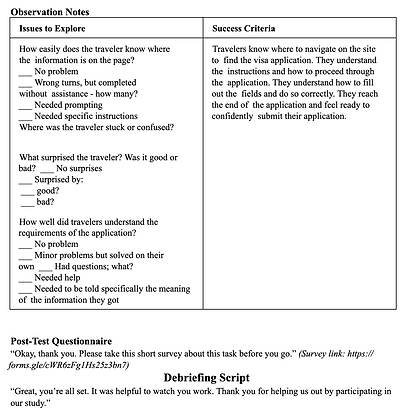
Baseline User Testing
Recruiting
We conducted the study on 4 participants total, with 2 participants per task. In other words, we had 2 participants fulfill the casual traveler user class and 2 participants fulfill the student user class. We only have 1 work role (American citizen), which was matched by all of our participants. None of the participants were classmates nor had any of them seen the websites prior to this study. All of the participants were students at UVA, but we felt that they fit the work roles because our age group could easily be both casual travelers and study abroad students. Speaking specifically to Task 1 (visa application), we acknowledge that we could have used older participants as our casual travelers which may have affected our results. However, we assumed that it was more likely that the younger generation would access an online visa application form, while it seemed more likely that older generations would use a paper application.
Procedure
We ran the study over Zoom. Everyone joined the Zoom call, though the facilitator was present in the room with the participant. The participant shared their screen and turned on their microphone, but everyone else was muted with their cameras off, taking notes.
Testing Materials
Task 1
Script
Provided Persona Information
(for consistency and privacy)


VISA Satisfaction Questionnaire


Task 2
Script

Finances Satisfaction Questionnaire


Results
UX Target Table updated with average of observed baseline levels for average number of errors, average time on task, and average rating scores across users from the satisfaction survey for each task

DESIGN
Design Production
Defining design solutions to reach target levels
Task 1
Target Level: Average Number of Errors ≤ 3
We identified common user errors caused by broken usability guidelines and proposed solutions:
-
Simplify sentence-long links in the "Visa Application" section using Gestalt principles (e.g., shorter text, icons).
-
Restructure the "Visa Guidelines Chart" to highlight relevant information based on user needs or improve its layout to make the application form more noticeable.
-
Reduce errors on the Visa Application form by clarifying ambiguous options, enforcing correct formatting, and enhancing the visibility of headers and choices.
These changes should significantly lower errors while allowing for a buffer due to the complexity of the process.
Target Level: Average Time on Task ≤ 13 minutes
Key issues slowing users down included:
-
Poor information scent made finding the visa form difficult.
-
The "Visa Guidelines Chart" was unclear and required restructuring.
-
Ambiguous options on the form led to unnecessary deliberation.
We expect these improvements to save over 3 minutes in task completion time.
Task 2
Target Level: Average Number of Errors ≤ 7
We identified key usability issues causing navigation errors, including:
-
Poor stimulus salience of links and options on the Chinese Embassy site. Adding icons, bright colors, and clearer link appearances will improve readability and recognizability.
-
Ambiguous titles and unclear wording, which will be reworded for clarity.
-
Misleading clickable headings on the Education Abroad site, which will be fixed to improve navigation.
These changes should address over half of the errors observed during user testing.
Target Level: Average Time on Task ≤ 10 minutes
Two major factors led to inefficiencies:
-
Low information scent made finding the Study Abroad site difficult. Fixing invalid links and improving navigation paths will streamline the process.
-
Users had to manually calculate program costs and convert currencies. An on-site cost calculator will eliminate these steps.
We estimate these improvements will save over 6 minutes in task completion time.
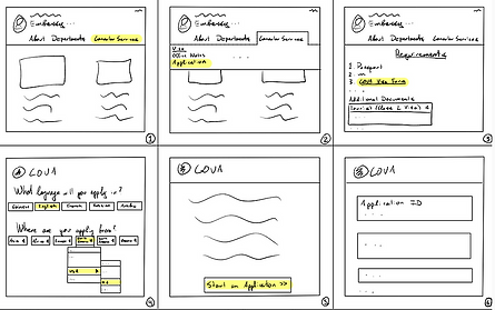
Ideation: Sketches
Homepage


Task 1 Visa Application


Task 2 Study Abroad Financials Calculator


Conceptual Design: Storyboards
Task 1 Visa Application

Task 2 Study Abroad Financials Calculator

Wireframes
Task 2 Study Abroad Financials Calculator
Task 1 Visa Application

IMPLEMENTATION
Interactive Prototype
We created a high-fidelity interactive prototype based on our user research and developing design solutions based on pain points found in the original website.
Interact with the prototype here! (Press F to enter full-screen)
Task 1 Completion Using Prototype
Task 2 Completion Using Prototype
TESTING
Validation User Testing
Recruiting
We conducted validation testing with 6 participants total, with all 6 participants completing both Task 1 and Task 2. Some of the participants had previously participated in baseline testing, while others had not interacted with the original website or participated in testing before.
Procedure
We ran the study over Zoom. Everyone joined the Zoom call, though the facilitator was present in the room with the participant. The participant shared their screen and turned on their microphone, but everyone else was muted with their cameras off, taking notes.
Testing Materials
Task 1 Script

Task 2 Script


RESULTS
Analysis and Report
After reviewing testing observation notes and gathering measurements, we updated our UX Target Table with the observed results from averaging the number of errors, time on task, and satisfaction scores across both tasks.
UX Target Table

Visualizing Results
Overall, the improvements we made in the user experience led to over 50% decrease in average number of errors and average time on task for both task 1 and task 2, surpassing our target levels. Additionally, satisfaction ratings greatly improved as well based on the responses to the satisfaction questionnaires, and surpassed or met target levels.
Task 1


Task 2


